Getting Crisp Small Text on Embroidered Patches
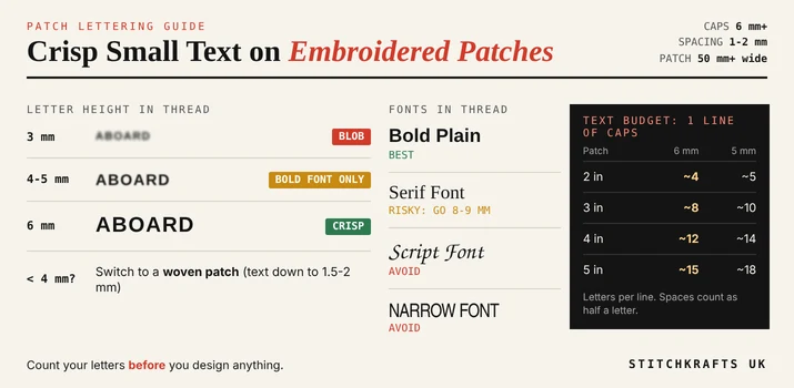
Quick answer: For crisp small text on an embroidered patch, keep capital letters at least 6 millimetres tall (about a quarter of an inch), use a bold, plain font, leave 1 to 2 millimetres between letters, and make the patch at least 5 centimetres wide. Fewer words fit than you think. If your text is smaller than about 4 to 5 millimetres, a woven patch will read better than embroidery.
Thread is thick. Ink is thin. That one fact is why text that looks perfect on screen turns fuzzy on a patch. This guide shows you exactly how much text fits, which fonts survive, and what to do when your words just will not fit.
The Three Numbers That Matter
Almost every patch maker agrees on these rules of thumb. Your own maker may adjust them slightly.
| What | Rough Rule |
|---|---|
| Letter height | At least 6 mm for capitals, or 4 to 5 mm for bold plain fonts with fine thread |
| Space between letters | About 1 to 2 mm |
| Patch size for readable text | At least about 50 mm wide |
Letter height is the big one. Below about 4 mm, the stitches start to merge and the little holes inside letters like a, e, and o close up. A 3 mm letter turns into a blob.
The Text Budget: How Many Letters Actually Fit?
This is the part nobody tells you. A patch is small, and the border and a margin take up space. So the real room for text is much less than the width of the patch.
Here is a rough guide for one line of capital letters. It assumes a bold plain font, with about 8 mm taken off each side for the border and a margin.
| Patch Width | Space for Text | Letters at 6 mm Tall | Letters at 5 mm Tall |
|---|---|---|---|
| 2 inches (50 mm) | About 34 mm | About 4 | About 5 |
| 3 inches (76 mm) | About 60 mm | About 8 | About 10 |
| 4 inches (100 mm) | About 84 mm | About 12 | About 14 |
| 5 inches (127 mm) | About 111 mm | About 15 | About 18 |
These are estimates. Narrow letters like I take less room, and wide letters like M and W take more. Spaces between words count too, at roughly half a letter each.
Try It on Your Own Words
A school wants "ST MARY'S PRIMARY SCHOOL" on a 3 inch patch. That is 24 characters, which needs a patch at least 6 inches wide. It will not fit.
Now shorten it. "ST MARY'S" is 9 characters. That fits a 3 inch patch at 5 or 6 mm. Better still, put the full name on two lines, or let the crest do the work, and leave only the name.
A rugby club wants "ESTABLISHED 1892". That is 16 characters. Change it to "EST 1892", which is 8, and it fits a 3 inch patch with room to spare.
Short words win. Count your letters before you design anything.
Choose a Font That Survives Thread
Not all fonts stitch well. Here is a simple guide.
- Best: bold plain fonts. Fonts like Arial Bold, Helvetica Bold, and Trebuchet Bold have thick strokes of even width. The stitches sit in neat columns, and the letters stay open.
- Risky: serif fonts. The little feet and thin lines get lost. If you love a serif, make it bigger, around 8 to 9 mm.
- Avoid: script and fancy fonts. Thin, joined letters turn into spaghetti in thread.
- Avoid: narrow fonts. Squeezed letters have almost no room inside them.
A bold 4 mm plain font often reads better than a thin 6 mm script. Thickness matters as much as height.
Spacing Rules
Print lets letters sit close together. Thread does not. Stitches spread a little when they sew, and letters that touch merge into one shape.
Open up the spacing slightly. About 1 to 2 mm between letters is a good rule. If your design software has a tracking or spacing setting, add a little. It will look too loose on screen, and about right when stitched.
Ask for the Right Stitch
This is the step most beginners miss. The same letters can be stitched in different ways.
- Satin stitch lays thread in tight, smooth columns. It looks the cleanest, and it works best for letters about 4 to 5 mm tall or more.
- Running stitch is a thin single line of thread. For very small text, below about 4 mm, it can stay readable where satin would clog.
- Light underlay is a thin layer of stitches under the letters that holds them in place. For small text, you want it light. Too much makes letters puffy and blurry.
You do not need to set these yourself. Just tell your patch maker that your text is small, and ask what stitch they will use. If you want to know more about how your design becomes stitches, our embroidery digitizing service explains the process.
Contrast: Make It Easy to Read
Even perfect letters are hard to read if the colours are too close.
Use light thread on a dark background, or dark thread on a light one. Avoid pale yellow on white, or navy on black. Keep text on a plain, solid area, never over a busy picture. If your design has a detailed emblem, put the words on a separate band or bar underneath.
Skip thin outlines around letters. They need to be at least about 1 mm thick, and they usually just make the text look cluttered.
Layout Tricks That Help
When your words will not fit, try these before shrinking the text.
- Cut words. Use "EST" instead of "ESTABLISHED", or "ST" instead of "SAINT".
- Use two lines. Stack the words, and make each line shorter.
- Drop the extras. If you have a motto, a year, and a name, you may only have room for two of them.
- Make the patch bigger. Going from 3 inches to 4 inches gives you about four more letters per line.
- Avoid curved text. Text on an arc needs more space, and it is harder to keep crisp. Keep small words on a straight line.
- Let the picture speak. Sometimes a clear symbol says more than a tiny word.
When Embroidery Is the Wrong Tool
Sometimes your text simply has to be small. Then it is time to change the patch type, instead of fighting the thread.

| Your Text | Better Choice |
|---|---|
| 6 mm tall or more, bold font | Embroidered patch |
| 4 to 6 mm, bold plain font | Embroidered, with a simple font and light underlay |
| Under 4 mm, or fine detail | Woven patch |
| Photo or full colour tiny print | Printed or sublimated patch |
Woven patches use very thin thread, so they can hold much smaller lettering. Published guides put the minimum around 1.5 to 2 mm for woven text, against about 6 mm for embroidery. If you need small words, like a motto, a website, or a year, take a look at our woven patches.
If your design is bold, with big letters and a clear shape, a classic embroidered patch is still the best choice for a raised, stitched look.
Test Before You Order
Do these three checks, and you can catch problems early.
- The ruler test. Print your design at its real size. Hold a ruler up to the smallest letters. Are they at least 4 to 6 mm tall?
- The arm's length test. Hold the printout at arm's length. Can you still read every word? Thread is less sharp than ink, so if it is hard to read on paper, it will be harder in thread.
- The proof. Ask your patch maker for a proof, which is a picture of your finished patch before it is made. Check the spelling, the spacing, and whether the letters look open.
Common Mistakes to Avoid
Choosing a thin or fancy font. Writing too many words for the patch size. Squeezing the spacing tight. Putting small text over a busy picture. Using low contrast colours. Curving small text. Skipping the ruler test. And approving a proof without reading every letter.
Frequently Asked Questions
What is the smallest text size for embroidered patches?
About 6 millimetres tall for capitals is the usual rule. Bold plain fonts can go to about 4 or 5 millimetres, with fine thread and careful stitching.
What is the best font for small text on a patch?
A bold, plain font with thick, even strokes, like Arial Bold or Helvetica Bold. Avoid thin, serif, and script fonts.
How many words fit on a patch?
Fewer than you expect. A 3 inch patch holds about 8 to 10 capital letters per line at 5 to 6 millimetres tall, so keep the words short.
Why does my patch text look blurry?
Usually the text is too small, the font is too thin, or the letters are too close together. Make it bigger, bolder, and add a little space.
Can embroidered patches have tiny text?
Not very tiny. Under about 4 millimetres, a woven patch is a better choice, since the thinner thread holds finer detail.
How big should a patch be to carry readable text?
At least about 5 centimetres wide. Bigger patches give you more room for bigger letters.
Ready to Make Your Patch?
If you are not sure your words will fit, send us your text and your size, and we will tell you honestly what works. StitchKrafts UK helps clubs, schools, and businesses in Manchester, Birmingham, and across the UK get clear, readable patches, and we can suggest a patch type that suits your design before you order.