
Preparing Artwork for Embroidery Digitizing: A Beginner's Guide
Quick answer: To prepare artwork for embroidery digitizing, start with the cleanest file you have, ideally a vector file like AI, SVG, or EPS. Remove the background, gradients, and shadows. Keep text at least a quarter inch tall and lines at least 1 millimeter thick. Use no more than about six solid colors, and tell your digitizer the final size and fabric. Clean artwork means faster digitizing and fewer fixes.
A machine cannot stitch a picture. It can only stitch what thread can actually do. So the job of "preparing artwork" is really the job of turning a picture into something thread can copy. This guide shows you how, in ten minutes, with three simple tests to check your work.
What a Digitizer Does With Your Artwork
Digitizing turns your artwork into a stitch file. The digitizer decides where every stitch goes, which direction it runs, how thick it is, and in what order the colors are sewn.
If your artwork is clean, the digitizer spends their time on those choices. If it is messy, they spend their time guessing what you meant, or redrawing it first. That costs time, and sometimes money.
Step 1: Find Your Best File
Look for your original logo file, not a copy of a copy. Here is the order, from best to worst.
| File Type | How Good Is It? |
|---|---|
| AI, SVG, EPS, or a vector PDF | Best. Sharp at any size. |
| High resolution PNG (300 DPI or more) | Good, if it is clean. |
| JPG | Okay, but check for fuzzy edges. |
| Screenshot, photo of a printout, or a website image | Last resort. Often too blurry. |
A vector file is made of lines and shapes, not dots, so it stays sharp when you make it bigger. If you do not have one, ask whoever designed your logo. Many designers have the original file.
If all you have is a blurry image, do not worry. A vector art service can redraw it into clean lines before digitizing.
Step 2: Know the Limits of Thread
Thread is thick, and it cannot do everything ink can. Here are the limits that matter most. They are rules of thumb, and your digitizer may adjust them.
| Element | Rough Minimum |
|---|---|
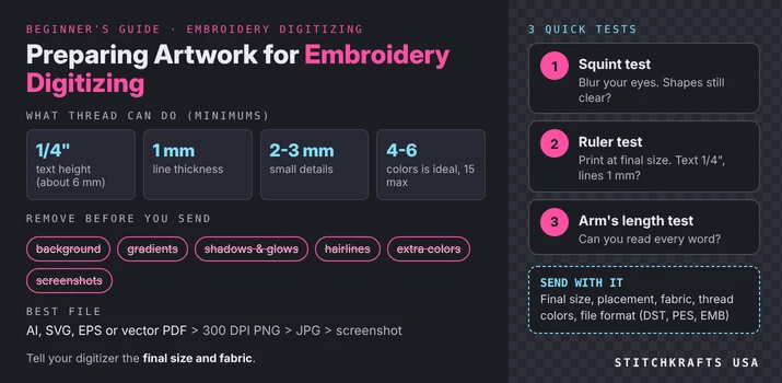
| Text height | About 1/4 inch (6 mm) |
| Line thickness | About 1 mm (0.04 to 0.05 inch) |
| Small details | About 2 to 3 mm |
| Gap between two shapes | About 1 mm |
| Colors | 4 to 6 is ideal, up to about 15 at most |
Anything smaller than these can blur, disappear, or make the thread break. Serif fonts, the ones with little feet on the letters, usually need to be a bit bigger than plain ones.
Step 3: Remove What Thread Cannot Copy
Go through your artwork and take out these things.
- The background. A white box around your logo can get stitched as solid thread. Make the background transparent, or tell your digitizer to leave it out.
- Gradients. A color that fades from dark to light cannot be stitched as a fade. It becomes a flat block, or a stripe. Replace it with a few solid colors.
- Shadows and glows. These are soft edges made of tiny color changes. Thread cannot do soft. Delete them.
- Tiny details. A thin outline, a small dot, a hairline. If it is smaller than the limits above, remove it or make it bigger.
- Extra colors. If two shades look almost the same, merge them into one.
Step 4: Make Text Safe
Text is the most common problem. Check three things.
- Is it big enough? At least about a quarter inch tall at the size it will be stitched.
- Is it bold enough? Thin, fancy fonts break up in thread. Choose a font with thick strokes.
- Is it turned into shapes? If you are working in a vector program, convert the text to outlines. That way the digitizer sees the same letters you do, even if they do not have your font installed.
Also leave a little more space between letters than you would in print. Letters packed tightly can blob together once stitched.
Step 5: Reduce Your Colors
Each color means the machine stops, and changes thread. More colors cost more time and money, and can make the design look busy.
Count your colors. If you have more than six, ask which ones you can drop or combine. For example, three similar blues might become one blue. Keep colors that are clearly different from each other. A pale yellow next to white will be hard to see in thread.
Write the color names or thread numbers next to each area if you can. If you have an exact brand color, say so, and ask for a thread chart, since screen colors and thread colors never match perfectly.
Step 6: Set the Final Size
Decide how big the stitched design will be, and tell your digitizer. A logo that looks great at 4 inches wide can fall apart when shrunk to 2 inches.
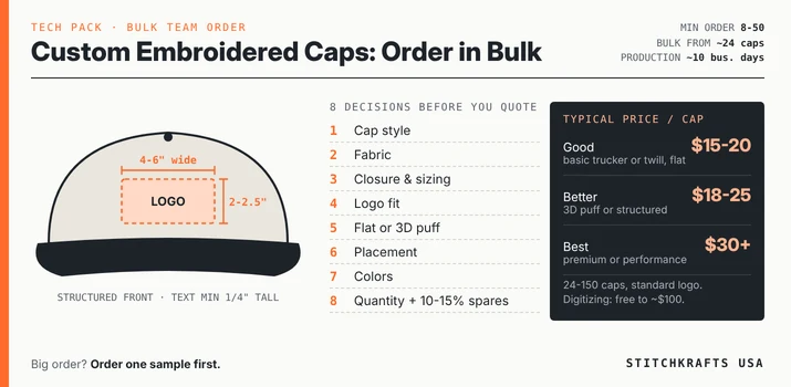
Common sizes are a rough guide. A left chest logo is often around 3 to 4 inches wide. A cap front is about 2 to 2.5 inches tall and 4 to 6 inches wide. A jacket back can be 8 to 12 inches.
If your artwork is a vector, set it to the final size. Check that the text and lines still meet the limits at that size.
The Three Tests
Before you send anything, run these three quick tests. They take about two minutes.
- The squint test. Look at your design and squint until it blurs. Can you still tell what it is? If the shapes blur together, thread will blur them even more.
- The ruler test. Print your design at its real, final size. Hold a ruler to the smallest text and thinnest line. Is the text at least a quarter inch tall? Are the lines at least 1 millimeter? If not, fix them.
- The arm's length test. Hold the printout at arm's length. Can you read every word? Thread is less sharp than ink, so if it is hard to read on paper, it will be harder in thread.
A Real Example: Making Over a Coffee Shop Logo
Say a cafe has this logo. A round badge with a steaming cup, a soft gradient background, a drop shadow under the cup, 12 colors, and small words underneath: "Fresh roasted since 2008" in a thin script font, about 1/8 inch tall.

Here is how you would fix it.
- Remove the gradient and drop shadow. Replace the gradient with one solid color.
- Cut the colors from 12 to 5. Merge the similar browns and creams.
- Make the small words bigger, or drop them. At 1/8 inch, they will not read. Either enlarge them to a quarter inch with a bolder font, or remove "since 2008" and keep the name.
- Thicken the steam lines. Thin curls can disappear, so make them about 1 millimeter or thicker.
- Remove the background. Save the logo with a transparent background.
- Set the size. Decide it will be 3 inches wide, and check everything again at that size.
The result looks simpler, and it stitches much better. It still looks like the same logo.
What to Send With Your Artwork
Include a short note with the file. This saves back and forth.
- Final size (width and height):
- Where it goes (left chest, cap, jacket back, patch):
- Fabric (cotton, polo, cap, fleece, jacket):
- Thread colors or color names:
- Machine file format needed (DST, PES, EMB, other):
- Anything that must stay exactly as it is:
Your machine format matters. Common ones are DST, PES, and EMB. Our embroidery digitizing service can deliver files in formats like these, so tell us what your machine reads.
Artwork for Patches Is Slightly Different
If your artwork will become a patch rather than go on clothing, a few extra things apply. A patch has a border, and a shape. Keep important details away from the very edge. Tell the maker whether you want a stitched border or a cut edge. If you are making a patch from a logo, our embroidered patches page shows the types and shapes available.
Common Mistakes to Avoid
Sending a screenshot instead of the original file. Leaving the background in. Keeping gradients and shadows. Using text that is too small or too thin. Sending 12 colors when 5 would do. Forgetting to say the final size. Not saying what fabric it is for. And not running the arm's length test.
Frequently Asked Questions
How do I prepare artwork for embroidery digitizing?
Use a vector file if you can, remove the background, gradients, and shadows, make text at least a quarter inch tall, and limit your colors to about six.
What file format is best for embroidery digitizing?
Vector files such as AI, SVG, or EPS are best. A clean, high resolution PNG is the next best choice.
What is the smallest text I can embroider?
About a quarter inch, or 6 millimeters, tall. Smaller than that and it can become hard to read.
Can embroidery do gradients?
Not as a true fade. Thread is solid, so gradients usually become flat blocks, or are suggested with different stitch directions. Replace gradients with solid colors.
How many colors can an embroidery design have?
Four to six colors is ideal. Many designs can go up to around 15, but more colors cost more time and money.
What if I only have a blurry logo?
Ask a vector art service to redraw it into clean lines. That is faster and cheaper than trying to digitize from a blurry image.
Need a Hand Preparing Your File?
If your artwork is rough, or you are not sure it is ready, send it to us and we will tell you honestly what needs to change. StitchKrafts USA works with embroidery shops, teams, and small businesses in Austin, Chicago, and across the country. We can clean up your artwork and turn it into a stitch ready file, so it comes out right the first time.